So here's the art spec he gave me for my first "assignment" :)
A Ship Being Invaded-
8"W x 10"H
A pirate aboard a ship at night. Several humanoid creatures (more than one, but it doesn't have to be dozens) are boarding the ship. It can be a combat scene, or a moment of lurking tension before the pirate notices them. The ship is only a setting, focus must be on the characters.
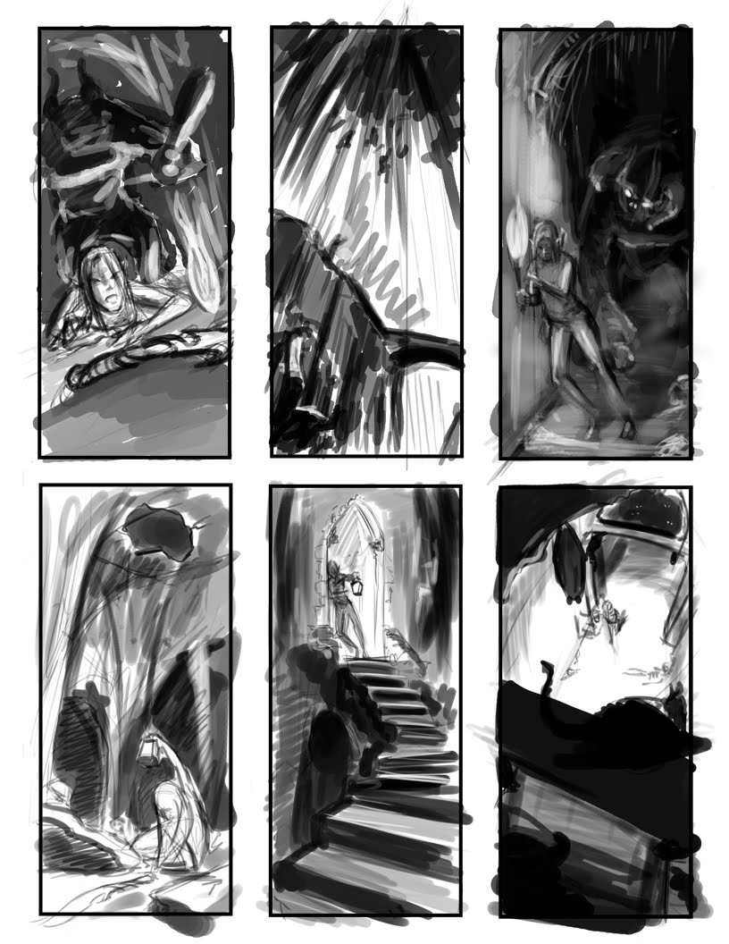
Certainly sounds like fun huh? So here are my thumbnails. I did at least 16, reallllly rough ones in my small Moleskine, but some were so rough I'd probably be the only one who would be able to tell what was going on. I made a point to only use a cheapy ball point pen so wouldn't be able to erase and get picky with the details. I took my 5 strongest ones and put them in Photoshop to clean up/clarify. There were a few others I still wanted to visit and see what I could do with them, but the main character is a tad too small I felt or it's face was hidden from view. So here they are:
 (click for larger image)
Certainly sounds like fun huh? So here are my thumbnails. I did at least 16, reallllly rough ones in my small Moleskine, but some were so rough I'd probably be the only one who would be able to tell what was going on. I made a point to only use a cheapy ball point pen so wouldn't be able to erase and get picky with the details. I took my 5 strongest ones and put them in Photoshop to clean up/clarify. There were a few others I still wanted to visit and see what I could do with them, but the main character is a tad too small I felt or it's face was hidden from view. So here they are:
 (click for larger image)


So here is my revised sketch... start color tomorrow :) Apologize for dark band in middle... went to Stinkos so I could use large scanner and told the guy to do it at 300 dpi... when I got it home it was at 150. Guess if you want something done right you have to do it yourself, so I had to use my standard size printer for my larger than standard size sketch (I usually try to work at least 1.5 times larger when sketching so I can get the detail I want)
Anyway... I think she is certainly feeling more lost now... at least when I look at it, her face seems to say, "Oh gods, not another wrong turn! Where am I now?
During painting phase the upper background is certainly going to evolve more, as well as make the archway more beat up looking and definitely edit any perspective issues. :)
Any comments?