 Well, here's to keeping my fingers crossed :) Wish me luck! Now it's on to more ideas! :D
Tuesday, December 14, 2010
Dungeon Delve Final
So here is the final I submitted for the Dungeon Delve Challenge on ArtOrder. Drum roll please...
 Well, here's to keeping my fingers crossed :) Wish me luck! Now it's on to more ideas! :D
Well, here's to keeping my fingers crossed :) Wish me luck! Now it's on to more ideas! :DDungeon Delve WIP - Color
Well... I think 'm about 90% there, just wanted some feedback before putting on the finishing touches and submitting. I decided I wanted a threat as well, so I added 3 hell hounds (since in Greek myth they always appeared in triplicate), but I wanted them silhouetted, barely seen with only the slightest detail indicated in rim lighting. :)
Let me know what you think!

Thursday, December 9, 2010
Tuesday, November 30, 2010
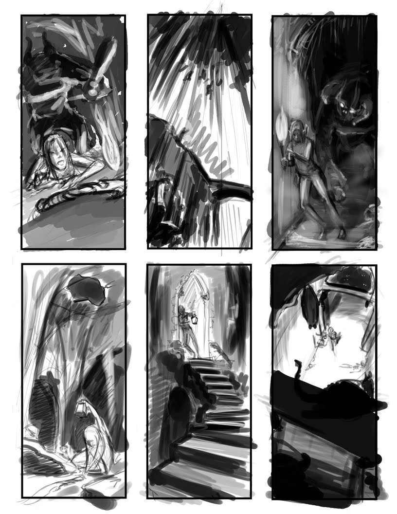
Dungeon Delve - WIP
So I've decided to post my WIP on the dungeon delve in the hopes of getting a little feedback.
The first 2 images are my sketch and quick value study submitted for the Sketch deadline:
Right now I'm leaning toward the second alternate image, with some tweaking involved of course. Thoughts, comments, harsh critiques?
The first 2 images are my sketch and quick value study submitted for the Sketch deadline:


The feedback I got was that the figure was looking good, but that there wasn't enough of a sense of being "lost" and that the image was looking a little cramped. Well... I'm inclined to agree.
So then I had to come to a realization that I may have to re-consider my composition. Before I totally considered that, however, I played with simply moving the composition up and down and playing with what was going on behind the character. I did this with tracing paper over my original drawing.... and while I was getting somewhere... it still felt stagnant.
So I did what any artist would do that wasn't satisfied with the original work, I took the image into Photoshop and started playing with the composition by adjusting the size of the character in the overall composition as well as adjusting her setting and other than the pose of the character ended up with a whole new image. These should be considered thumbnails I suppose since they are definitely in a very rough stage, but I think they get the picture across so to speak ;)

In this first image I kept the foreground element the same, but changed the size of the main character and her surroundings have also changed to show that there is more to the dungeon than that cramped space she was in before.

Right now I'm leaning toward the second alternate image, with some tweaking involved of course. Thoughts, comments, harsh critiques?
Thursday, November 11, 2010
More thumbnails

Ahhh.... It is so nice that the muse has decided to grace me with her presence again. Helps that I've got a topic that I'm having fun with and it's getting back to my fantasy art roots. So to continue with the post from yesterday, here are some more. I've taken the ideas of some and refined them and did a few more new ideas that i had up in my head swimming around but just couldn't get down on paper yesterday.
So here they are. Feedback welcome if there's anyone reading LOL

Wednesday, November 10, 2010
Art Order Dungeon challenge
So I joined ArtOrder and decided to partake in the Dungeon challenge. So here are my thumbnails. Any feedback would be welcome as I have to submit the sketch by Sunday ;) But this is the first I've had to work on it since I've had other commission work to do.
I like the idea of #1 and 3 but the composition needs work. I like the composition of #4, 5 and 6, though I think #4 could still be made more dramatic by changing the angle. #2 was just a quick getting an idea down on paper.
Let me know if I'm headed in the right direction.
Monday, October 18, 2010
Quasi Update
Hello everyone... I think there are like 5 of you now...
Sorry I haven't been doing much lately, but I have been busy with a full time job and freelance job on top of it. I would love to share the work I have been doing for this freelance job, but unfortunately it is NDA and so you will have to wait until production is finished and the short is released for the first time.
I can tell you that it is for an animation company, it's for a short film and the art department and storyboard department consists of yours truly. Yep, that means I have done all the developmental character and set sketches, gesture drawings, expressions, initial color studies AND the storyboards. Let me just say that Storyboard Pro, by Toon Boom is an excellent tool! While storyboarding you can keep an animatic in mind, plan accordingly, draw right into the program or import images, keep track of time while you go along and so on. Fabulous! Drawing tools can be a little slow, but another plus is that the program is vector based so it holds up under any resolution! Yay!
I finally finished up the boards tonight after a week of hard work and now I have to complete the final full color paintings of the sets and characters. Really pretty concepts pieces (which probably means redrawing a few things here and there in order to make sure it still looks pretty and all the perspective is on the up and up LOL)
So until this job is completed, I rarely have time to post anything new. My first plan of work once I can once again listen to my own muse is taking up Mike Buffington's 1,000 head drawing challenge. Oh... it will happen. So keep your eyes peeled for my progress postings on that one.
Then... a story or two... what will it be? ;)
Stay tuned...
Cheers!
Melissa
Thursday, February 18, 2010
Nightfall
So I just finished reading Nightfall by Isaac Asimov and Robert Silverberg. Brilliant! Imagine a world that has six suns, never knows darkness, never sees the stars, and then once every 2,049 years there is an eclipse: and everyone loses their minds!
I've been meaning to get some "sci-fi" into my portfolio since I don't have any, and it seems like everyone is looking for some. So since I was so inspired, I'm taking time away from the mad scientist's apprentice to visit Nightfall.
Here are some very small composition thumbnails followed by two gray scale moment thumbnails :)
 Inspired by Joko's thousand thumbnails ;)
 A sandstorm approaches the archeology dig
 The observatory overlooks Saro City and is a major story point. An establishing shot.
Wednesday, February 17, 2010
Images from 4 is a little, 4 is a lot and a domain name...
So I just realized I never really posted any work from the kids' book I was working on and well, I figured since we're getting down to handing in our bios and getting close to publishing, I figured I could share my stuff.
Four is a little when it's only four blueberries.
Four is a lot when it's Four watermelons

Four is a little when you only have four seashells from your trip to the beach
Four is a lot when you're trying to fit your four favorite toys into your suitcase
The other collaborative images will have to wait I guess since, all I have available is the kids I provided for the cover and the birthday scene at the end. But I think you get the idea from the illustrations I've posted.
In other news: I've just purchased my domain name! Yay! www.melissakochart.com.
Official website coming soon... Stay tuned for launch date :D
Four is a little when it's only four blueberries.

Four is a lot when it's Four watermelons

Four is a little when you only have four seashells from your trip to the beach

Four is a lot when you're trying to fit your four favorite toys into your suitcase

The other collaborative images will have to wait I guess since, all I have available is the kids I provided for the cover and the birthday scene at the end. But I think you get the idea from the illustrations I've posted.
In other news: I've just purchased my domain name! Yay! www.melissakochart.com.
Official website coming soon... Stay tuned for launch date :D
Thursday, January 28, 2010
So I get my fancy dinner... :D
Yes, I know, it has certainly been less than a drawing a day, you have permission to slap my hand and scold me all you want. However, I am presenting 3 images for your viewing pleasure today. Again we are continuing with the story of The Wonderful Wizard of Oz.
 The first image is the landing site in Munchkinland. The goal of course was to get as much vibrant color in there as possible to contrast with the drab gray of Dorothy's house and home of Kansas, as well as her very faded dress.
 This next image is of course Dorothy traveling the Yellow Brick Road. She follows the road through the farming area of Munchkinland, where the favorite color is blue, hence the blue farm fences.
 I found myself struggling with the image of Dorothy and the Scarecrow meeting... I feel I need a few more thumbnails before I feel completely comfortable with that one. But here is Dorothy and her friend the Scarecrow, entering the woods where they will eventually meet the Tin Woodsman.
It's at this point where the tone of the movie turns a little more somber for a few beats, hence the colors are more subdued... plus, they are deep in the woods.
These were all done using Photoshop, a program I am much more comfortable with. Unfortunately, I also tend to get caught up in too much detail when using it. I hat to force myself to simplify. I think I could have done better with that LOL.
Well tomorrow we're heading off to visit the snow and try our hands at snow boarding. I am expecting to fall down a great deal number of times and to have a fabulous time doing it. So I will not be posting anything until probably Sunday or Tuesday. :)
Stay tuned for more adventures in Oz...
(Oh! And PS: I met the deadline, so I get a surprise fancy dinner somewhere.
Anyone care to venture a guess? I'll fill you guys in on the next posting.)
(Oh! And PS: I met the deadline, so I get a surprise fancy dinner somewhere.
Anyone care to venture a guess? I'll fill you guys in on the next posting.)
Monday, January 18, 2010
A drawing a day keeps the blues away
Derek, my wonderful boyfriend, gave me a challenge to complete 5 pieces of work by January 28th. If I meet the deadline, we're eating out at my favorite restaurant Luella in Russian Hill, or some other gourmet digs. If I fail, we're getting Little Ceasar's Pizza. Either way he wins.
So while most people make a New Year's resolution to get back in shape, mine is a little different this year. I would LOVE to get back in shape, be able to run for miles without stopping, but after searching for a full time job for nearly eight months, it's time for a different type of workout. DRAWING, or at least creating new work.
So the goal: to do at least one drawing a day, even if it's just a doodle. This includes sketches in ye ole sketchbook as well as playing with digital media.
Since I do far better coming up with ideas for other people's stories (at least lately. I'm sure all this creative "exercise" will eventually inspire me to resume work on The Last Tooth), I decided to visit The Wonderful Wizard of Oz by L. Frank Baum. And as my dream job is to work in the art department of a certain animation studio that shall remain nameless so as not to show favoritism, I realize I need to push my style a little more. First assignment that I have given myself: produce full color story beats (to help create a color script) using Illustrator. Not only will this actually force me to stylize, it will force me to ignore detail and focus on light, shadow, composition and color. This is good for me as far as expanding my horizons and also allowing me to work a bit more quickly.
The first piece was completed Friday afternoon, the second, just a few hours ago. I know what you're thinking: "Melissa? A drawing a day? Where is the one from Saturday?" Well, sometimes life happens, people, and occasionally I must pay attention to my wonderfully supportive boyfriend, even if it means it takes time away from me beating his challenge :P.
So, for your perusal and enjoyment, I present the first two story beats from The Wonderful Wizard of Oz:
 Rather than go completely gray-scale for Kansas, I made everything very desaturated. The most saturated source of color is the sky and clouds, because it is the storm that ultimately whisks Dorothy away to the wonderfully beautiful and colorfully vibrant land of Oz. The framing is done to demonstrate how vulnerable a small Kansas farm would be. Baum describes them as being more surrounded by the storm, but for the sake of communicating a looming storm with one image, I thought this was a good choice.
 The second image is up inside of the cyclone. I wanted to present a more dynamic view than simply the house being held in the mouth of the cyclone as it is depicted more often in storybooks, or just outside of the cyclone as it is shown in the theatrical version. In the book, Dorothy almost loses Toto through the trap door that originally led down to the storm cellar, but now leads to nothing but whirling air. I played a bit more with effects in Illustrator on this one, as well as the brush tool :)
"A strange thing then happened.
"The house whirled around two or three times and rose slowly through the air....
"In the middle of a cyclone the air is generally still, but the great pressure of the wind on every side of the house raised it up higher and higher..."
--L. Frank Baum "The Wonderful Wizard of Oz"
I think I could still play with this one a bit more. We shall see :)
TO BE CONTINUED... (dum dum DUM!)
Subscribe to:
Posts (Atom)
So here is my revised sketch... start color tomorrow :) Apologize for dark band in middle... went to Stinkos so I could use large scanner and told the guy to do it at 300 dpi... when I got it home it was at 150. Guess if you want something done right you have to do it yourself, so I had to use my standard size printer for my larger than standard size sketch (I usually try to work at least 1.5 times larger when sketching so I can get the detail I want)
Anyway... I think she is certainly feeling more lost now... at least when I look at it, her face seems to say, "Oh gods, not another wrong turn! Where am I now?
During painting phase the upper background is certainly going to evolve more, as well as make the archway more beat up looking and definitely edit any perspective issues. :)
Any comments?